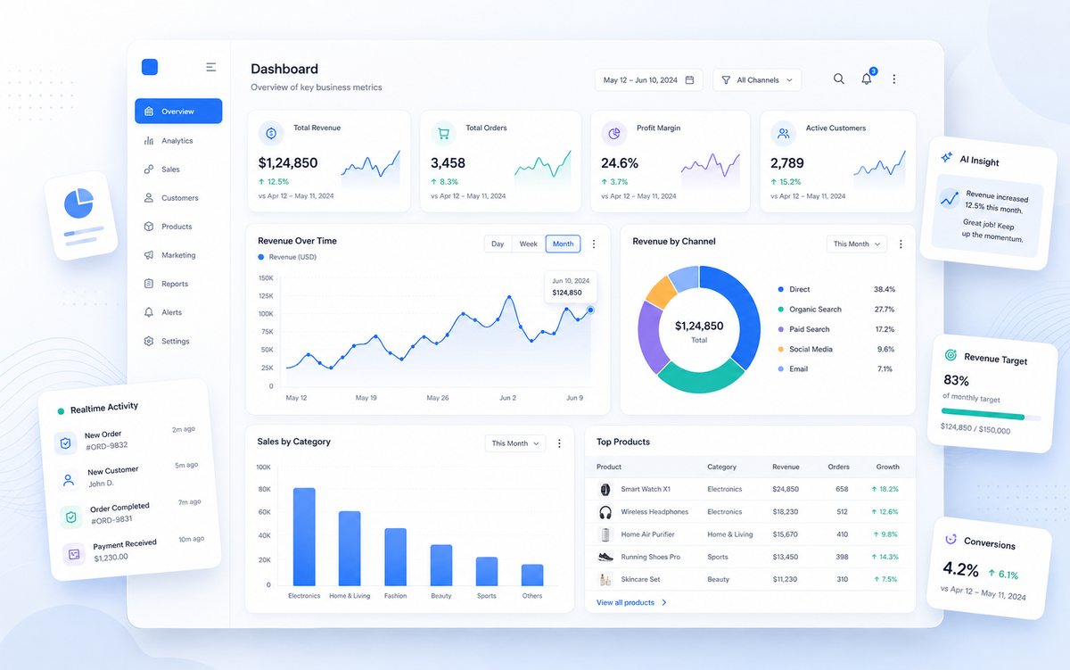
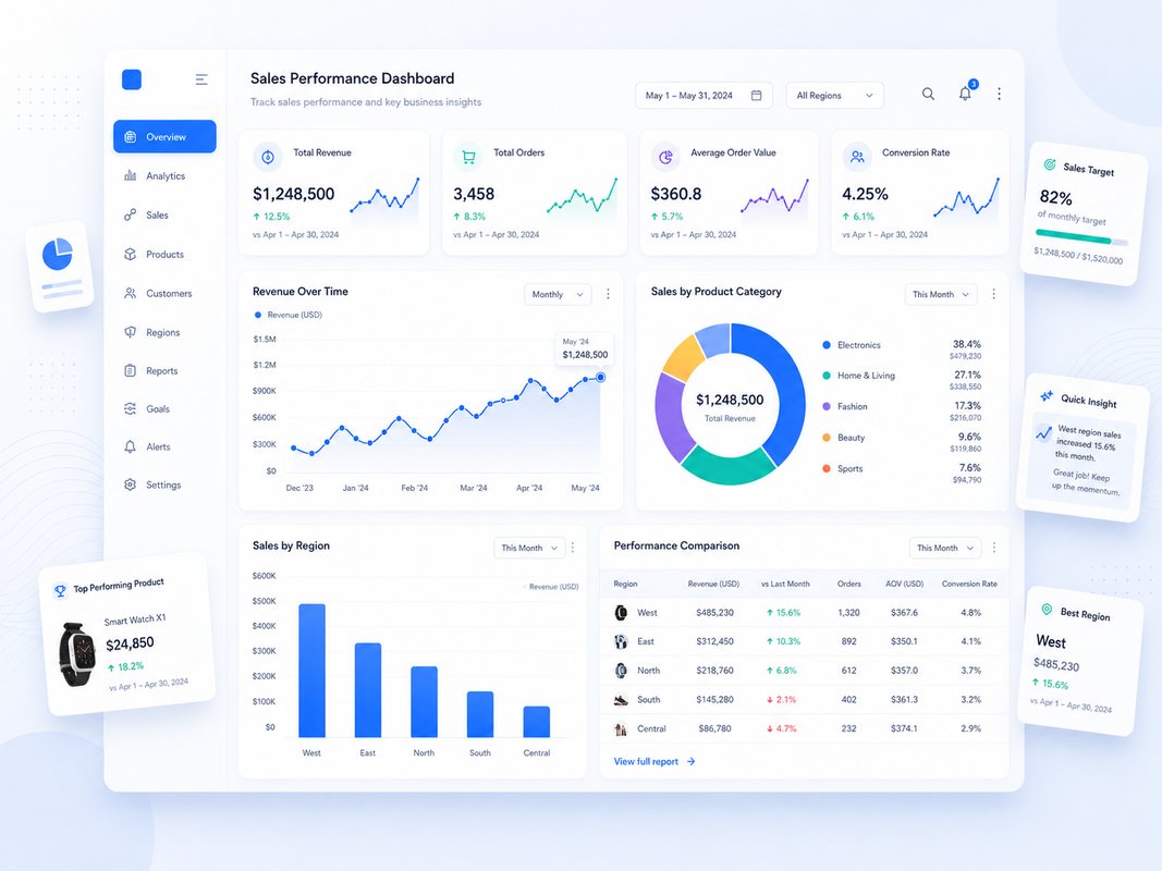
Privacy-first analytics support • NDA available • Remote deliveryofficial.datavero@gmail.com   |   WhatsApp +91 91995 85752
Selected Work

Analytics case studies and dashboard examples

Explore practical reporting projects that show how DataVero structures business data into clear KPIs, visual dashboards, and decision-ready insight summaries.

Sales performance dashboard
Sales Analytics

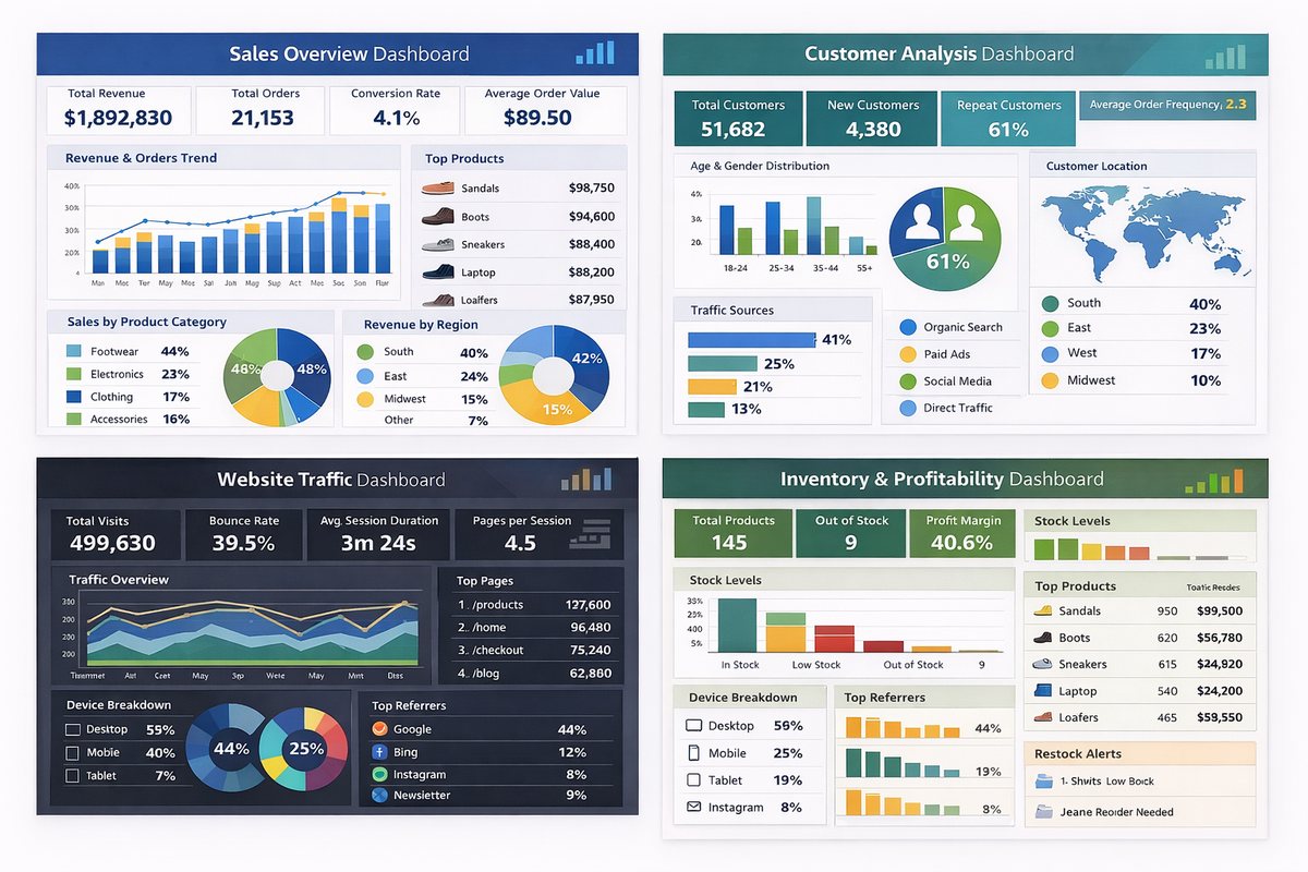
Sales Performance Dashboard

Business need: A single view of revenue, orders, customers, product performance, and sales movement.

Work completed: KPI cards, trend chart, channel mix, top-product table, category comparison, and executive-style dashboard layout.

Reporting value: Decision makers can review performance faster without switching between multiple spreadsheets.

Customer and sales insights dashboard
Customer Insights

Customer & Sales Insights Dashboard

Business need: Customer and sales data needed a cleaner structure for identifying buying patterns and revenue contributors.

Work completed: Customer segmentation views, sales summaries, visual breakdowns, trend sections, and management-ready reporting blocks.

Reporting value: The dashboard helps highlight important customer groups, sales performance areas, and review points.

Automotive sales dashboard
Automotive Analytics

Automotive Sales Overview

Business need: Automotive sales performance needed clear comparison across dealers, manufacturers, vehicle categories, and regions.

Work completed: Dealer summary, manufacturer comparison, vehicle performance visuals, map-based view, and KPI-led reporting structure.

Reporting value: The dashboard gives a quick operational view of what is selling, where performance is stronger, and which categories need review.

CO2 analytics dashboard
Environmental Data

CO2 Analysis Dashboard

Business need: Complex environmental data required a visual format for easier comparison and reporting.

Work completed: Data structuring, trend visuals, comparison charts, summary sections, and presentation-ready dashboard layout.

Reporting value: The output makes large datasets easier to understand through clean visuals and focused summary points.

Business performance dashboard
Business Reporting

Business Performance Dashboard

Business need: A practical reporting layout was needed for monitoring KPIs, trends, and business activity in one place.

Work completed: KPI blocks, chart sections, clean layout hierarchy, report navigation, and business-focused summary areas.

Reporting value: Teams can present performance more clearly and reduce time spent preparing manual report views.

Executive analytics dashboard
Executive Dashboard

Executive Analytics Overview

Business need: Managers need a concise dashboard that turns scattered data into a high-level performance overview.

Work completed: Dashboard wireframe, KPI hierarchy, trend visuals, category performance blocks, and insight-focused report structure.

Reporting value: The dashboard design supports faster review meetings and clearer business conversations.

Delivery Standard

How DataVero builds each reporting project

Each project is organized around business questions, clean data preparation, dashboard clarity, and practical final delivery.

1

Understand the business question

Identify the KPIs, audience, data source, reporting frequency, and final output needed.

2

Prepare the data

Clean duplicates, formatting issues, missing values, inconsistent labels, and structure problems.

3

Build the dashboard

Create charts, KPI cards, filters, tables, and visual sections that answer the key questions.

4

Deliver with clarity

Provide the final dashboard or report with a short explanation of important findings and usage notes.

Ready to improve reporting?

Build a cleaner dashboard or reporting workflow for your business.

Share your Excel, CSV, sales, customer, finance, or operations data requirement and get a practical analytics solution.

Start a Project